What is Pre-Press?
The word “Pre-Press” describes the processes a book undergoes before it goes “on press,” that is, before the printer starts printing it. It can include all non-printing activities, including editing and design; however, in book publishing you’re most likely to hear it in the context of operations that are done to get the finalized file ready for the printer.
Is it Pre-Press or Prepress?
It depends who you ask. As of early October 2024, Merriam-Webster lists “prepress” while Oxford is sticking, for now, with “pre-press.” It’s a case of a new-ish compound word undergoing the gradual change to a closed compound with, in the end, no space or hyphen between its two parts. See the previous post for a discussion of that topic. I’m deferring to Oxford for this post.
Pre-Press Stages
It’s easy for a first-time author to assume that a book is just about ready to print once the edits and revisions are complete. But there are many steps it still has to go through, and many hands through which it needs to pass. Let’s look at the stages that happen after the author and editor have signed off on the final copyedit changes.
Quoting
This stage, in fact, should happen very early in a book’s journey, but it belongs to the pre-press workflow.

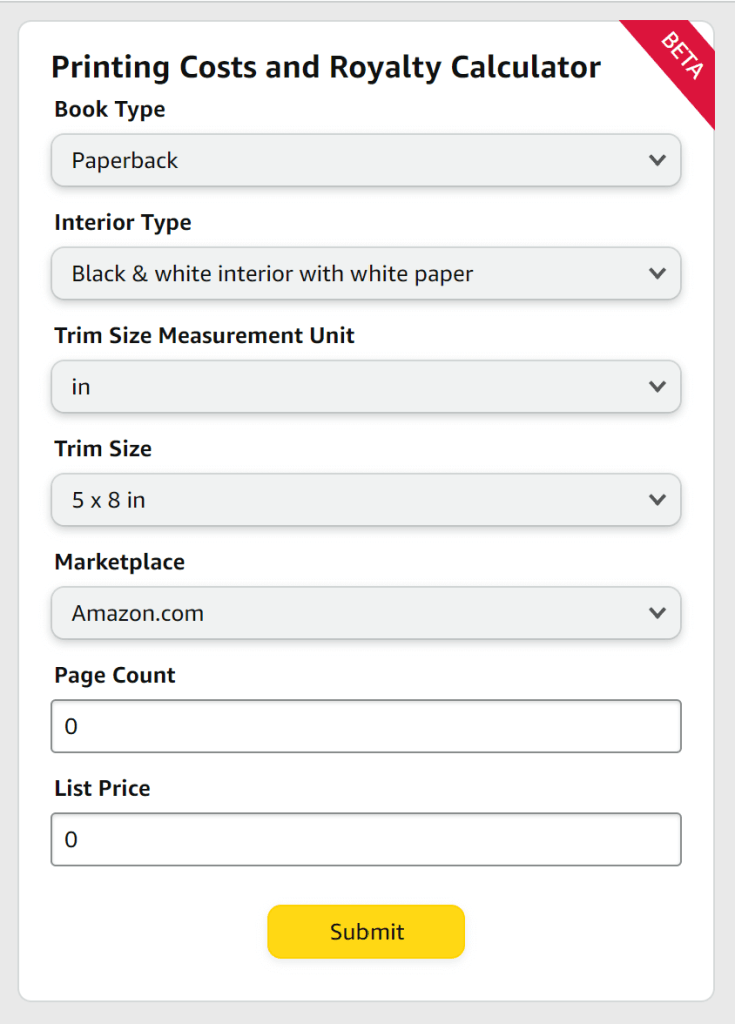
Before a book is designed, the publisher (or self-publisher) must know what format they will have it printed in—a decision that requires knowing what options their printer has available and determining what they will cost. In traditional publishing, a member of the production team will request quotes from the printer with select variables of trim size, page count, paper weight, binding type, etc. Printers that work with self-publishers tend to have a menu of sorts where their clients can combine certain options to come up with their own cost.
Once the quote is settled, the printer can provide the publisher or self-publisher with a template indicating the exact height and width of pages, covers, and spine, as well as the amount of clear area and bleed that must be accounted for.
Design and Layout
Book design includes creating the cover—a process that usually goes through many iterations as an illustrator may be hired and the editorial and marketing teams will repeatedly weigh in—and making decisions about the overall look of the book. The designer will choose typefaces and make layout decisions. If illustrations are involved, they will format them correctly. Everything is done with the printer’s templates in mind so that the final book file will match the specifications that were quoted on.
Book design is a complex art that involves knowing expectations for different genres and audiences and tracking trends. The designer is responsible for the full “book package” that convinces a buyer to pick it up in the first place, so they need to know what appeals to the people who are interested in this kind of book. The designer will work with the art director for illustrated books, and with the typesetter for text-heavy ones. At small companies, some or all of these roles may be combined.
Typesetting
Typesetting is the process of arranging the interior text of a book on the page. A typesetter has to choose a suitable typeface, type size, and line spacing for the book’s audience, arrange settings and presets in their design program (often Adobe InDesign in professional publishing), and then “pour” each chapter onto the pages. They add consistent and harmonious formatting for headings, captions, and other text elements. In the past, of course, they would have been manually “setting” each piece of type into a form to build the pages that would be inked and pressed into paper for the final product.
Over time, typesetting has developed a set of rules and guidelines for making printed texts more readable and attractive. The typesetter subtly manipulates the placement of the type in order to eliminate problems like:
- widows—when the last line of a paragraph sits alone at the top of a page
- orphans—when the first line of a paragraph sits alone at the bottom of a page
- hyphen ladders—when several lines in a row end with hyphens
- word ladders—when several lines in a row end with the same word
- bad breaks—when a hyphen is used to break a word across two lines for better spacing, but the placement of the hyphen makes it hard to read (The dots that dictionaries place in multisyllabic words indicate the correct placement for “good” breaks.)
- rivers—when the spaces between words in a justified block of text form a distracting visual path over the page
The typesetter must also do their best to make the book’s final page count match the publisher’s expectations. Not only do book pages need to be in multiples of either 16, 8, or (rarely) 4, depending on the printer, but some genres and audiences come with distinct preferences for longer or shorter books. To meet the page-count requirements, a typesetter might change their type size, increase or decrease line height, and add or remove pages between chapters. Sometimes, if the outcome is still significantly different than the page count that was quoted on, the editor may receive a request for additional content.
Indexing
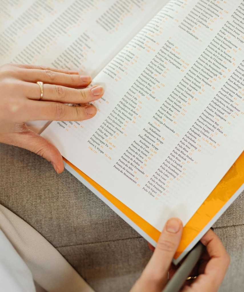
Many informational texts have indexes to help readers find where significant topics are discussed. Indexing software exists to make formatting the index more straightforward. The indexer and editor create a list of pertinent topics and words, and the indexer combs through the text for the places where they appear. Searching the book’s PDF for instances a word is helpful, but the indexer must also identify places where a topic is discussed without using that exact word. This includes searching photographs, graphics, charts, and illustrations. The final index is alphabetized, and the page number(s) for the most definitive discussion of each term is often set in bold.
Proofreading
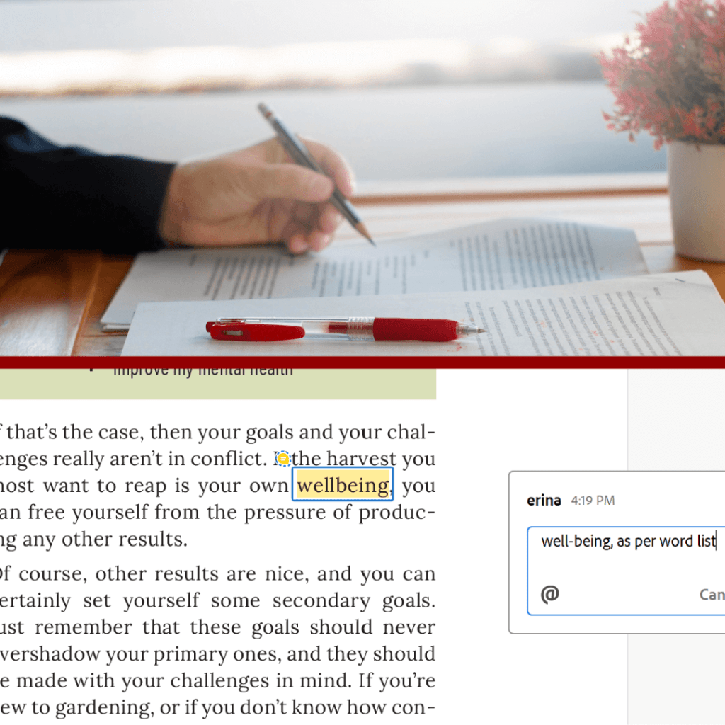
Once a book’s layout and typeset are fully complete, the proofread begins. It should not be attempted sooner, because every design change carries the possibility of reflowing text, or even of accidentally covering some of it. The proofreader works to ensure accuracy and consistency throughout the book using a style sheet (this details the publisher’s policies on certain aspects of style, spelling, and punctuation that don’t have hard-and-fast rules) and a word list (provided by the copyeditor, this is an alphabetical list of words, names, and places that arise throughout the book; it serves as the ultimate authority on their spelling and capitalization).

The proofreader looks for:
- typos, spelling errors, and punctuation mistakes
- formatting errors
- extra spaces
- missing page numbers or other flawed elements in the margins
- widows, orphans, ladders, bad breaks, and rivers that the typesetter missed
- page inaccuracies in the table of contents and index
- and more.
Print Readiness
Aside from all the visible design issues, there are many technical requirements the files need to meet in order to print successfully. The following is a partial list of those requirements.
Resolution and Colour
Any images used in a print book must meet minimum resolution requirements, usually 300 dpi (dots per inch). They must also be formatted with CMYK colour, not RGB colour. Sending files with images set to the wrong colour profile will result in your colours not printing accurately.
Bleed and Trim Area
The files must be set up with exactly the right amount of space left for bleed and trim area; otherwise the final product might have unsightly gaps at the edge of images and background colours, or the text might be too close to the edge of the page.
Adherence to the Template
Cover templates are exacting. The graphics the designer intends to land on the spine must line up precisely with its placement on the book block, because even a millimetre’s discrepancy will be obvious.
PDF Profile
Each printing press is calibrated to work with files that are exported with a particular profile. There are often regional differences in profiles favoured.
Once the production team is confident that the files are ready, they upload them to the printer. At that point, a representative at the printer examines them and may request further changes if they fall short in any of these areas.
Proofs
Proofs are a vital part of the pre-press process. They show how the colour, placement, and page order will come out in the final product. If any problems with how a book is printing are discovered at the proof stage, it’s the printer’s responsibility to fix them. However, if a publisher signs off on the book without discovering the error, the onus is now on the publisher. You can see why it’s vital that proofs be examined with rigorous care.
Not too long ago, it was a matter of course that one or more sets of physical proofs would be sent to a publisher for any book being prepared for press. These would include the cover and/or jacket as a single unfolded sheet, and the interior pages stacked in order, either loose or stapled. None of the page proofs would be trimmed. Further in the past, these physical proofs might even have been shared with the author, since they wouldn’t have had a complete PDF of the design to review.
Now, physical proofs are still an option, but publishers may also choose to save costs and time by reviewing digital proofs instead. It’s not advisable if colour accuracy is important, but for books with black-and-white interiors, a publisher might opt to receive a physical proof of the cover alone and approve the interior on screen.
Advance Copies
The final stage of approval happens when the printer sends an agreed-on number of finished copies of the book to the publisher. These are often hand-bound because the final, expensive step of putting the whole print run through the mechanized binding process won’t happen until the publisher gives their assent.

Pre-Press Checklist
Are you a self-publishing author getting a book file ready for press? Click here for my checklist of things to do before hitting “upload,” informed by twelve years of working in book publishing.


Leave a comment